Theme Creator
This plugin allows you to create style libraries based on Material Design concepts (https://m3.material.io/).
The basic principle of Material Design styles is to define only one color (background and line color identical) in each style. These styles can then be used in Industrial Graphics elements.
Material Design defines a wide palette of colors, all identified by a name. Our plugin imports only the main colors and uses the User_Defined_XX styles, which are limited to 24 in System Platform.
It is preferable to use this plugin at the very beginning of a new System Platform project, as the plugin will redefine all "UserDefined_XX" styles, which should therefore not already be used in Industrial Graphics.
Create a Style with the Material Theme Builder
Go to the website https://material-foundation.github.io/material-theme-builder/
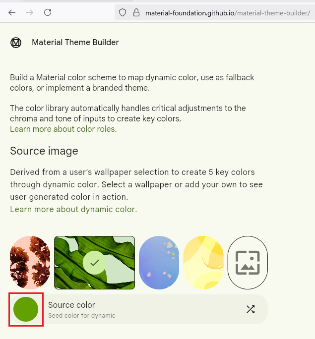
Select a primary color by clicking on the "Source color" circle.
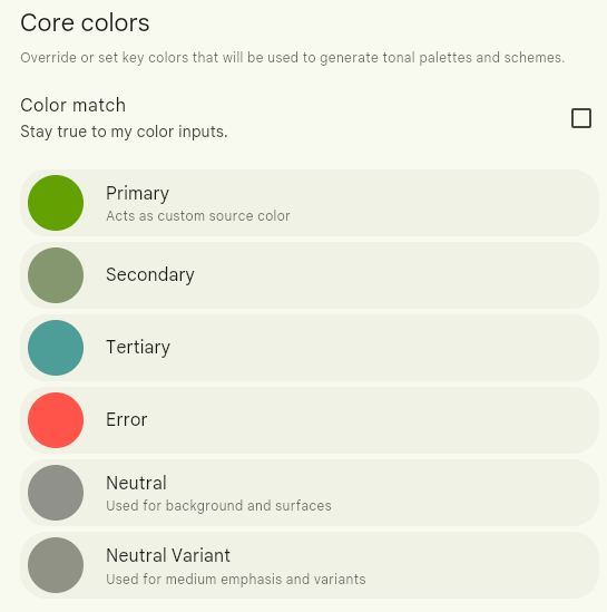
The palette of "Core Colors" (Primary, Secondary, Tertiary, Error, Neutral, Neutral variant) is automatically generated.
It is also possible to select these colors individually by clicking on the color circles.
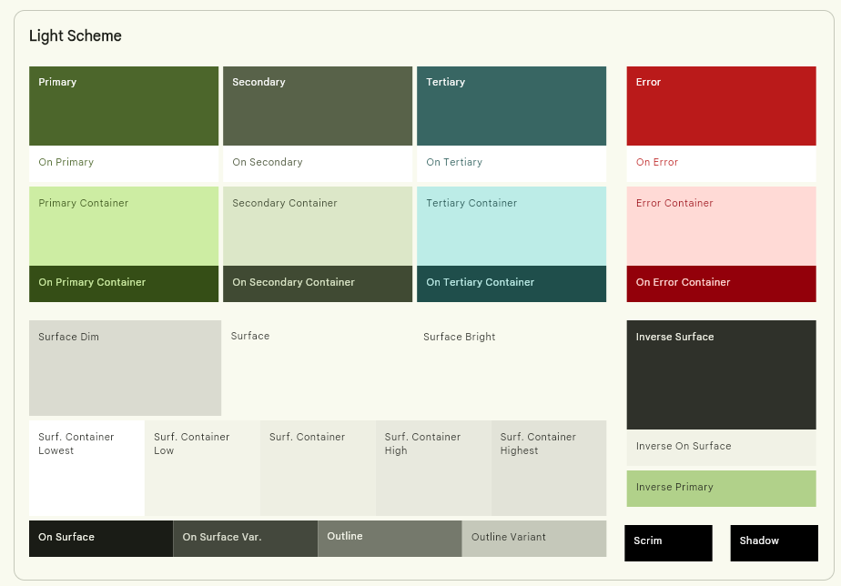
The color palettes for the "Light" and "Dark" themes are automatically updated on the right side of the page. The entered colors are automatically adjusted to improve contrasts and gradients.

Standard Material Design components are also displayed to show the theme rendering.
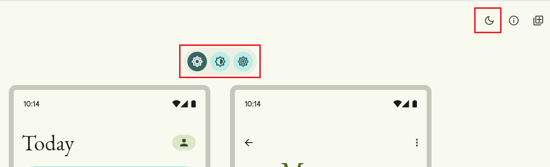
You can preview a variation of the same theme on the current page by clicking on the buttons at the top of the page ("Standard contrast," "Medium contrast," and "High contrast," as well as the "Switch to dark/light mode" button).
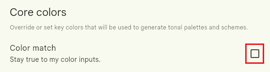
The checkbox "Stay true to my color inputs" allows you to keep exactly the "Core Colors" that were manually defined.

Once the theme is defined, click on the "Pick your fonts" button at the bottom right of the page.

Click on the "Export theme" button.

Click on the "Web (CSS)" button.
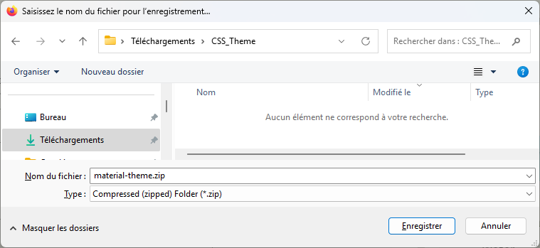
Save the ZIP file.
Export the Model Style Library
The plugin uses a "Model" style library from which it generates new style libraries. Only the "UserDefined_XX" styles are configured by the plugin. The other styles remain identical to those in the "Model" style library.
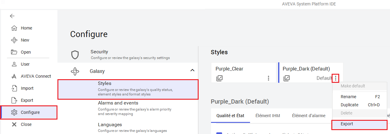
Click on the "Galaxy" menu, then on "Configure," and then "Styles." Click on the "..." button of the model style to export and then click on "Export."
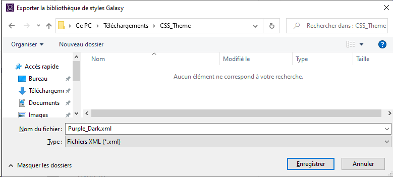
Click "Save" to save the XML file of the style library.
Generate Styles with the Plugin
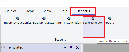
Click on the "Scaderis" menu and then on "Style Generator."
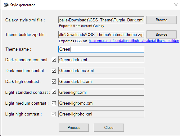
Next to the "Galaxy style xml file" field, click the "Browse" button and select the XML file of the previously exported "Model" style library.
Next to the "Theme builder zip file" field, click the "Browse" button and select the ZIP file exported from the Material Theme Builder.
Enter a name for the new theme in the "Theme name" field.
By default, 3 light themes and 3 dark themes are generated: standard, medium contrast (mc), high contrast (hc).
The checkboxes allow you to deselect themes that will not be generated.
Click on the "Process" button.

Click "OK."

The XML files for the style libraries corresponding to the selected themes are generated in the folder "C:\Users<username>\Documents\ScaderisPlugin\Themes."
Import Styles into the Galaxy
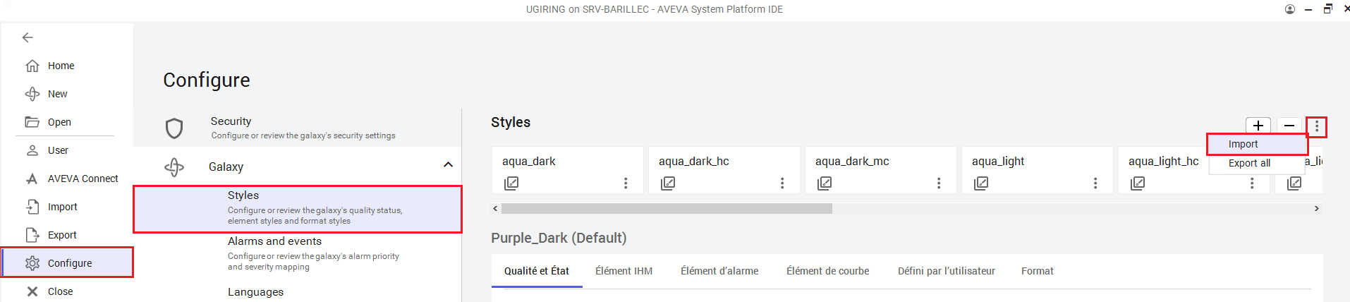
Click on the "Galaxy" menu, then on "Configure," "Galaxy," and then "Styles." Click on the "..." button and then click on "Import."
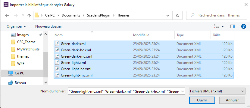
Select the style libraries to import from the folder "C:\Users<username>\Documents\ScaderisPlugin\Themes," then click "Open."
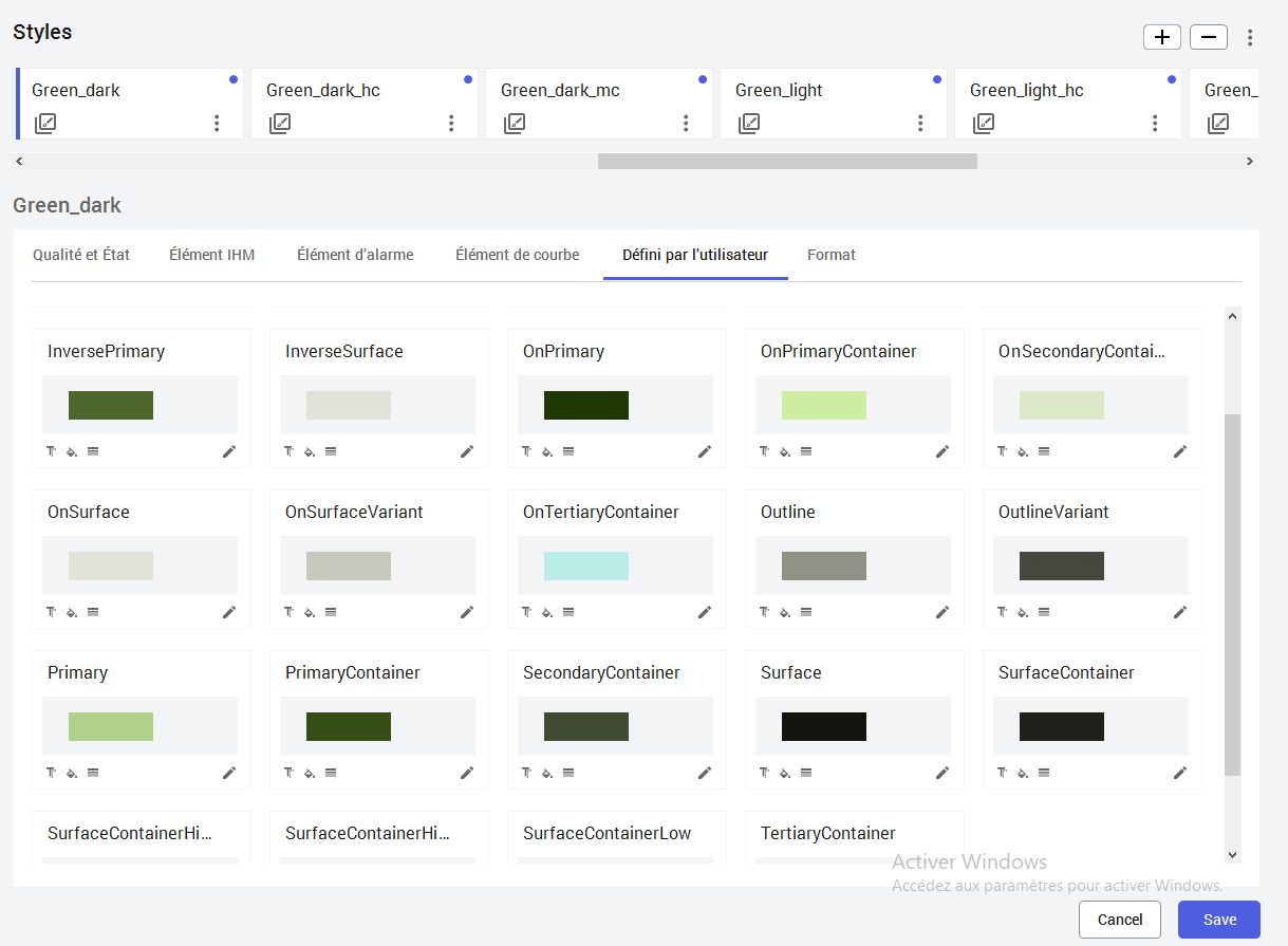
The new style libraries are imported. By clicking on the "User Defined" tab, you can see that the "UserDefined_XX" styles have been renamed, and the theme colors have been configured.
Click the "Save" button.